
January 31st, 2010
NEW WORKS

Leonard R. Craig Art Gallery
Unity College, Unity, Maine 04988
207-948-3131
January 21 - February 20
Opening Reception: February 4th, 4-5:30 p.m.
Gallery Hours; M-F 10-6p.m. Sat. 1-5 p.m.
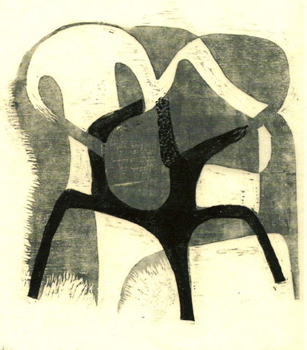
Image: Swallows (Detail)
January 5th, 2010
Kenyon College

The 'smell of ink' is the response you are likely to get if you ask a printer their initial attraction to the process. This was certainly true in my case to the extent that after discovering printmaking the first year of art at Kenyon College I found this little used letterpress studio in the basement of Pierce Hall. I soon became the Director and went on to found two other letterpresses: The Hopewell Printer and the Highland Press. Several years later I gave up the letterpress to focus on fine art printmaking.
January 5th, 2010
The 'Castle'

... found myself in the historical ship captain’s home known as Tucker Castle. With spectacular views of the Sheepscot River, this studio became the work site for large scaled paintings many of which for the theatre.
January 5th, 2010
The Chocolate Factory

After graduating from Kenyon, I established a fine art printmaking studio in an old chocolate factory. That same year I founded The Hopewell Printer, a turn of the century letterpress facility. My work in the studio consisted primarily of mezzotints and I was included in several national and international exhibitions.
Midcoast Printmakers at the Caldbeck Gallery
The instructors from the Midcoast Printmakers Inc are having their work exhibited at the Caldbeck Gallery in Rockland Maine starting October 9th until November 14th. The opening reception is from 5 - 7 pm Friday night October 9. The gallery is located at 12 Elm Street, Rockland, Maine 04841. Contact information: 207-594-5935 or www.caldbeck.com, [email protected]..
The artists include:
Debra L. Arter
Holly Berry
Nancy Freeman
Frances Hodsdon (cover design)
William B. Martin
Kay Miller
R. Keith Rendall
Studio
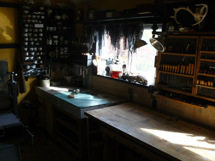
Unlike a painter's studio, this studio was designed to capture light in a most unique way. The ceiling is 'folded' like a nun's habit. The windows face south towards the Sheepscot River and are relatively small compared to most studio thereby controlling the amount of relected light off the plate surface. This makes for an easier time working the details on the plate. The marble table has a heating element and is used to ink the plate prior to printing. Note the sea turtle skull in the window. This will be the subject of a forthcoming print.
Intaglio and Relief Prints: Defining the More and the Less
Reprint from an article:
by Nicole Olivier
Journal of the Print World, Winter 2000
As the image is produced from below the surface, so too is the implied meaning behind the forty or more evocative studies that printmaker R. Keith Rendall calls “an investigation and reassertion of the relationship of man and nature”. In his show, entitled Excess and Defect there will be landscapes and various life forms to examine, but the artist is clearly opposed to being labeled a naturalist. His primary goal is to create a quality etching using the vitality of the sublime. That energy is generated as much by technical process as by the many hours of close observation, at the edge of the sea, under a microscope, or while harboring a snapping turtle in a bathtub. The result is a fusion of sensation and image, akin to the union of ink to paper in the etching and engraving process.
Rendall uses his subject matter, be it the underside of a horseshoe crab or a decimated landscape as in Select Cut, to be the vehicle for his exploration in the medium. As he draws from life, the plate will contain the image. The time he spends with each plate informs him on the additive and subtractive process of the creation and while this fascination with life forms comes forward, through definition and shadow, he leaves the creatures to themselves. He may aquatint a single plate eight or nine times as he did with his turtle etching, Noli Me Tangere, to give the line more substance, then crosshatch to break it up, as he does with precision on the legs of a lobster. But these are not pretty animals. This artist defies the beautiful aspect of nature so the viewer can come away with the image for itself, and in itself. Rendall’s prints are known to be dark, even gloomy. They evoke the seventeenth century masters. He references the inspiring woodblock engravings of Demenico Beccafumi, (Late Renaissance). The results are rich and atmospheric. He rarely uses color, preferring the visceral quality of black and white and of sepia to create his emotional range. The effect is luminous and tonal.
Unlike many nineteenth or twentieth century artists, R. Keith Rendall’s intent goes beyond illustration or storytelling. From drawing to engraving, the simple becomes the complex, psychological. He believes “the first requires guts, the other an act of faith”. Unsatisfied with drawing as an end product, his challenge lies in pushing the balance between tradition and exploration. In revealing the illusory and tentative nature of the technique, he finds it is much like the inevitable disharmony in balance between humans and the environment. “I like the failures as much as the successes when it looks as if I barely had a hand in it, and can revisit it later…My favorite pieces are the ones I am the most detached from.”
The River Tree Arts Gallery will complement Rendall’s show, which is divided into four parts, and the rooms vary in size to direct the viewer closer or further from the images. The first is On Hard Ground. The play on words looks at his relationship to the earth as well as the literal markmaking on the etched plate. The Lumberyard and abandoned fields, among others, are a visual record indicating people’s powerful presence in the environment, even after they’re gone. The next part is a series of shell studies On Form and Linearity. Here is shape as metaphor. Their beauty lies in their restraint. The spiraling nature of these sensual, reticular objects constitute evolutionary change. Most of these tiny etchings measures less than 2 x 4 inches. Rendall has printed the series on pale colored paper, often a single shell commands the space. Their textural tone is achieved through aquatinting, line etching and sepia ink. The ephemeral quality of Cone Shell, in which the ancient form is tentatively balancing in an evolving, dark rectilinear space is haunting and powerful.
The third portion is entitled On Mordants and Design. All of the subjects are skulls recently dead. Here, detachment, has become its own creature, and the corrosive technique literally defines the lost vitality the animals once had. Dutch mordant acid, used for copper plates, bites slowly and is wonderful for fine lines and aquatints since the depth of the bite is easy to control. Like the process of death and decay, Rendall reworks the loss into something meaningful. Less becomes more. His aquatint of a flayed lamb entitled Lambing imbues the creature with strength and it achieves a certain beauty. Blood and tissue become form and line. Rendall is a collector of things living and dead. He has studied them in their natural habitat and preserved them in their mortality to draw and understand them.
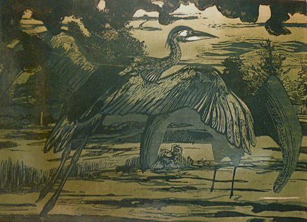
The final part called The Aged and the Unknown brings the viewer full circle, from the dust of the earth to the mysteries of life. The horseshoe crab, the turtle and lobster are as ancient as time. These prints retain the animals’ dignity. There is a Great Blue Heron woodcut that includes woodcut layers and drypoint. The finished product will be the artist’s most experimental. “There is a difference between my subject and my image. It is this distinction that defines the more and the less of my subject and represent the excess and the defect of my image”, Rendall writes in his artist’s statement.